How to give Ecommerce Website Structure and How to get it Right

No one will want to shop from a so disarranged store to the extent that finding something is next to impossible. As you come up with your e-Commerce website structure, keep that in mind.
Remember that it serves the purpose of a physical shop and never overlooks the need for the proper format. Failure to do so may end up watering down the convenience of online shopping.
Equally important, there are a million and one e-Commerce websites out there. One way of being the favorite online store is by perfecting its structure. If the e-Commerce website structure is vital to your shop's success, how then do you ensure that you get it right?
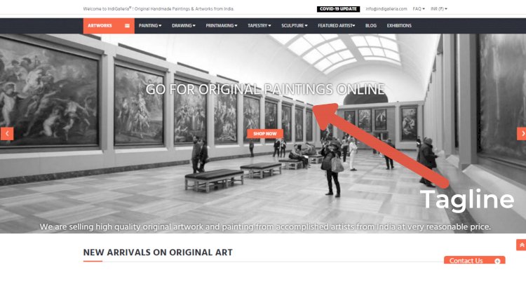
Fortunately for you, this article got you covered. I have tried to discuss it with an example of how IndiGalleria, An online Art Gallery gave its site the ideal e-commerce structure, and how you can give an e-Commerce website structure by doing it right.
Before we move forward, if you wish to also read about How to Build your E-commerce Business from Scratch
Check it out!
17 Tips on how to give your Ecommerce Website the Right Structure
The structure should be taken seriously from the word go. Otherwise, you may not get it right at the end. This segment is about what you should do:
Create a plan
Like any other structure, developing a plan is crucial if you want it to be a success. Preferably, go for the hierarchical model with the apex symbolizing the homepage. The next level should be for the categories followed by the subcategories level and so on. Don't forget to include tags as well. Here are a few tips on it.
First, the ideal number of categories is 10 to avoid complicating the structure as time goes by. Subcategories can range from 5 to 10 but not more than the categories. No category and subcategory should share a name either. Avoid situations whereby users have to click many times to reach a particular page.
The categories, sub-categories and sub-sub categories of Products.
Structure the URLs
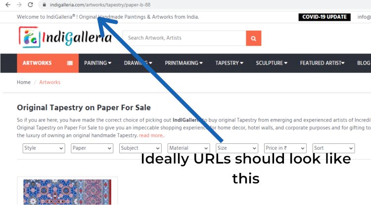
Now that the plan has led to the formation of a hierarchical structure, the next step is to create URLs that will help form the actual design. See to it that they are also simple. The category URL could be as follows
www.storename.com/category/categoryname
On the other hand, the URL of the subcategory page could be as follows.
www.storename.com/category/categoryname/subcategoryname
The two URLs compliments a hierarchy and are also quite simple.
Select the Correct Tags and Categories
Some of the essential aspects of an eCommerce website structure are tags and categories. Therefore, the store owner should choose them wisely, basing them on various relevant keywords. It would be wise to benchmark what tags and categories the competitors' sites are using. Once you identify the ones that are doing quite well, use them as your website's main categories.
You can use the ones that are not doing well but complement the main categories as the site's subcategories. The rest makes it easy to categorize products but aren't as vital as the subcategories can make great tags.
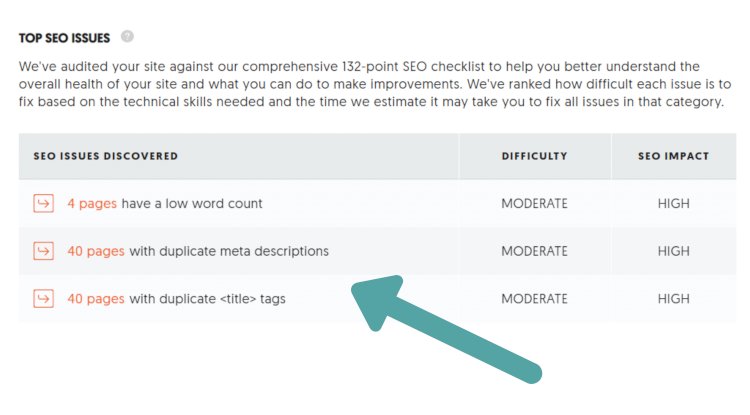
Every category and subcategory page should be SEO optimized using metadata and content-rich in relevant keywords. Avoid duplicate pages at all costs since it could result in irrelevance in the SERPs, links losing equity, and the pages ranking poorly.
Using a free tool, Ubersuggest helped us a lot in the beginning stages of our e-commerce site-building. We could identify the duplicate pages, title, meta-description and select the correct tags and categories.
Ensure that you don't end up facing the problem of keyword cannibalization. The issue occurs when several pages target the same.
Also Read: How to Rank for the Products that You sell for your E-commerce Business?
Proceed to the Creation of a Homepage
Create a menu on it that links to products and categories. Ensure that there is a link to every category and subcategory on that site so that even new visitors can easily navigate.
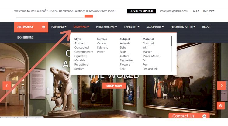
Besides categories and subcategories, add top brands, top categories, discounts, and the latest offers. They can help new visitors easily interact with your site easily and also find various products quickly.
Please don't clutter the landing page with too many product recommendations because they can reduce conversions.
Paginate Categories
If a specific category has many products, displaying it on a single page may not make much sense. It would mean that the page would take forever to load, which can be time-consuming. However, keeping the items on various pages by pagination would solve the issue. Each page would hold several products and consequently load fast.
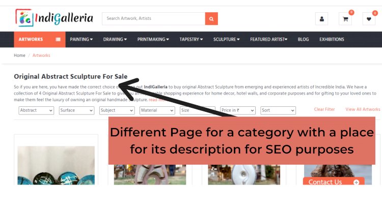
Prioritize Internal Linking
It makes it easy for visitors to find related products and pages, improves website authority, and promotes the hierarchy even further. As much as they don't do as much as the external links, they can make a huge difference.
You can link your Blogs to your product description and Product Description to your Blogs, inter-product linking as well as inter-blog linking too!
Also Read: How to write a Blog for E-commerce in 2021?
Handle Broken Links
You don't want to frustrate visitors who visit your site because they might never come back. However, if they click broken links, they are most likely going to leave right away. Consequently, your site will have a low average session duration and a high bounce rate. Such factors can affect your SEO adversely.
You can use various SEO tools for this purpose to identify and remove the Broken links from your e-commerce site.
Must Read: Top 10 SEO tools for your E-commerce Business
Maintain Simplicity
The importance of the site's structure is to make it easy for a shopper to buy something. That's why your design needs to be simple, clean, and straightforward. Under such circumstances, the buyer will pay attention to the sale, increasing the chances of closing a deal.
However, with pop-ups, banners, ads, and colors screaming all over, a sale may be challenging.

Make it pleasant and give some air to breathe. With easy navigation to the menu and easy checkout, processes try to make customer's life simpler.
Brand yourself accordingly
Online buyers will use credit cards to pay for the product or service. They have to trust you to do so lest hackers and fraudsters access their credit card information. How do you earn that trust so that people can feel safe shopping with you? That's where branding comes in.
Let your visitors easily identify what your eCommerce site is all about including information about it. Let it help you stand out from the rest by highlighting how different you are.
You can place your Tagline on the Home Page along with the colours combination suiting the aesthetics of your brand!
Put yourself in the shoes of the website visitor
Thinking like the audience helps you develop an eCommerce website that serves them right. From design to navigation, don't ignore excellence and ease of use.
Ensure that your product arrangement is something a user can easily relate to after a short period. Simplify the shopping and checkout processes as much as possible.
Before launching your e-commerce website or even during the course of running it, it is highly advisable to conduct purchasing of products through your own site and for your relative or friends to help you out with the same, as this would help you look how swiftly your purchasing journey was, and of course, be like a customer while doing so and give yourself no margins.
Must Read: What is an E-commerce CRM and why do you need it?
Choose colors wisely
There are many colors, no secret but do you know what their different inspirations are by any chance? Color is powerful enough to bring out various actions, emotions, and feelings in people. Therefore, as you choose the colors, make sure that they inspire the reaction you want from your visitors.
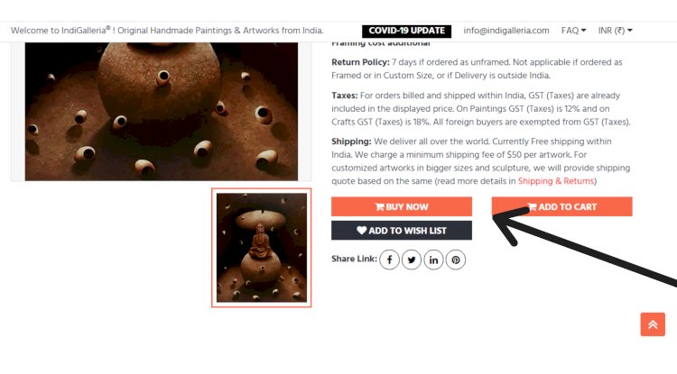
For instance, a red/Orange/Pink button can increase your sales by 34%. On the other hand, blue makes users trust your business.
Select high-quality images
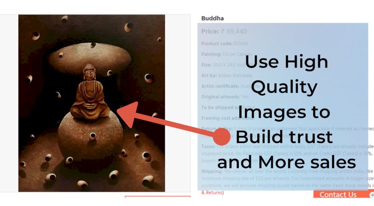
Such images will make the customers feel as if they have an idea of what they are getting from their purchase. They will also have confidence in your company. Such trust could make them comfortable enough to transact on your eCommerce site.
This is an aspect that you need to highly invest in, as this can either be a deal maker or breaker. We have always asked our artists to send their best, high-resolution images but also at the same we have to keep in mind the images have to be optimized and not too heavy to make the page loading speed high.
I repeat, Don't ever compromise on your Product image quality.
Also read: 7 Best Hosting for Ecommerce Businesses Websites
Scannable content and Responsive Site
These two make it easy for users to grasp what you are offering quickly. Very few people are willing to spend time reading stories about your offers.
Can you imagine trying to zoom content in or out trying to see what you can buy from their mobile phones? That's why this feature is also essential.

Easy Checkout
Please don't make this process long because it is as discouraging as an untidy product page. On the contrary, ensure that it is effortless, straightforward, and fast. Equally important, notify them after successful payment.
You must ensure you get transactional mail and the checkout confirmation, these things are very important for your customers to build trust.
Must read: The Ultimate Guide to Email Marketing Strategy for E-commerce
Easy-to-navigate categories
Can you imagine spending hours searching for a single product? The annoyance of having to click repeatedly before reaching the relevant page is something customers will avoid, like a plague. A significant eCommerce website structures allow users to search using filters. Criteria include product type, size, color, and price. It saves time and also increases the chances of generating sales.
Ratings and Reviews
People don't want to learn from their own mistakes. That's why they usually consider the recommendations of previous buyers.
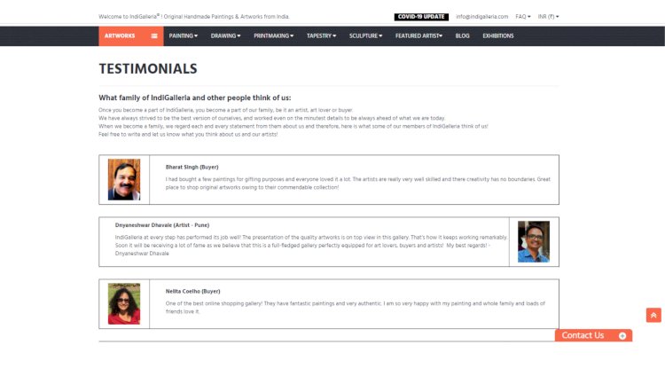
They often turn to reviews and ratings before buying the product. Include those segments so that good ratings and reviews can encourage purchases.
Testimonials can also do the trick.
Also read: Ecommerce Marketplaces or your Own Ecommerce site?
Professionalism
Again, this also helps with building trust. It makes buyers share sensitive data such as credit card information without any fear. Therefore, sales are likely to increase.
Using a secured payment gateway for your e-commerce purposes solves the problem for you! and also builds the trust of your customers to come back again for future shopping!
Final Words
If you want your online shop to have a structure that makes customers keep coming back, follow such guidelines. Some of them will improve your navigation, making it easy for buyers to interact with the site. Others will make it easy for users to trust you enough to share credit card information and other sensitive data with your site. They will make help the users focus on products increasing their chances of buying.
Others will improve your site's SEO, making it easy for the pages to high rank. Perfect linking will ensure that Google displays even the site links, which is also a good thing for your website. Thanks to a great user experience, the conversion rates will also improve.
Last but not least, the right eCommerce website structure will ensure that your site ranks for a wide range of keywords. Therefore, you need to get it right. Using the above tips will help you do so.
